
Hanson Capital: Rebrand and Conversion System for Qualified Investors
I redesigned Hanson Capital's visual identity, landing pages, and production system to elevate brand perception, improve lead quality, and enable rapid testing without losing consistency.
A Brand Designed to Attract Better Leads
Hanson Capital needed to improve the quality of its leads. The brand was generating interest, but not always from the right profile: accredited investors with more than $1M to invest. The challenge was not only to make the brand look better, but also to build an identity and landing page system that would help communicate clearer, build more trust, and filter better from the very first contact.
I redesigned the visual identity, developed templates for campaigns, and set up a landing page system designed to test messages, structures, and calls to action without losing brand consistency.
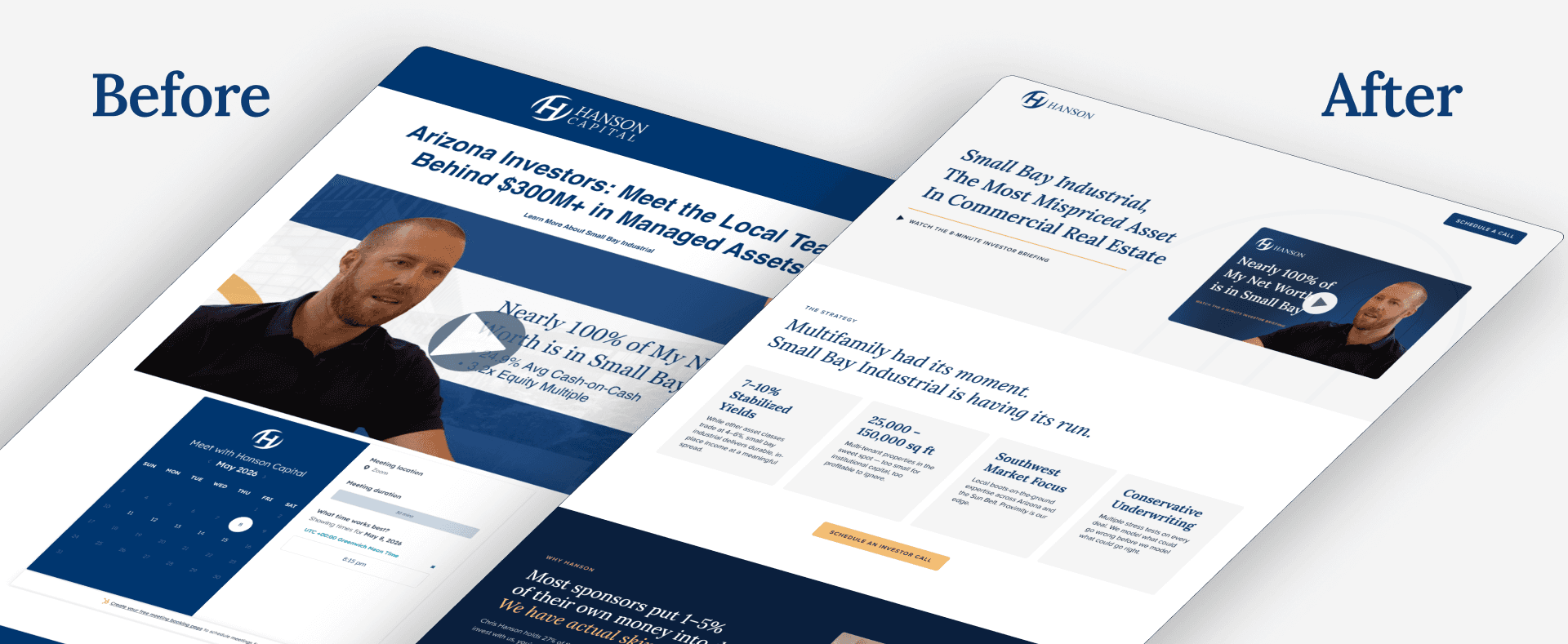
More Interest Didn't Mean Better Opportunities
The main problem was that previous communication could generate clicks or interest, but it didn't necessarily attract the type of investor Hanson was looking for. For a real estate investment brand, visual perception is part of the filter: if the brand looks generic, unpolished, or too promotional, it might attract curiosity, but not necessarily trust.
The new direction had to speak to a more qualified, sophisticated, and selective audience, without losing commercial clarity. At the same time, the system had to support performance marketing: landing pages, ads, copy variations, A/B tests, and constant production by other designers.
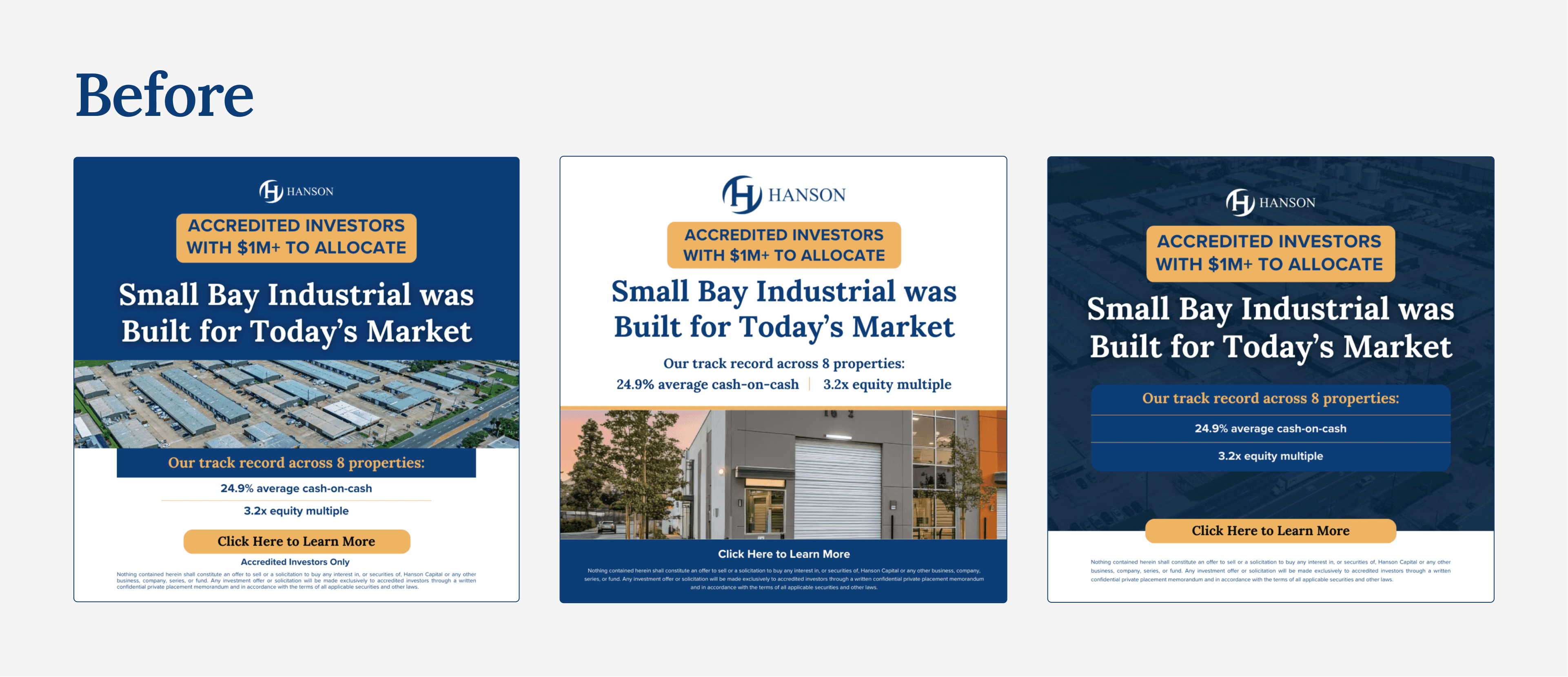
Previously, the brand relied on more rigid pieces with an aesthetic closer to a direct response ad than a premium investment brand.
From Generic Communication to a More Selective Brand
The previous identity felt closer to a direct sales piece than a premium investment brand. The redesign aimed to clean up the hierarchy, reduce visual noise, improve the use of space, and build a more sober, trustworthy, and editorial presence.
The new direction maintains commercial clarity but elevates brand perception: fewer elements competing for attention, more focus on the message, and an aesthetic better aligned with an accredited investor audience.
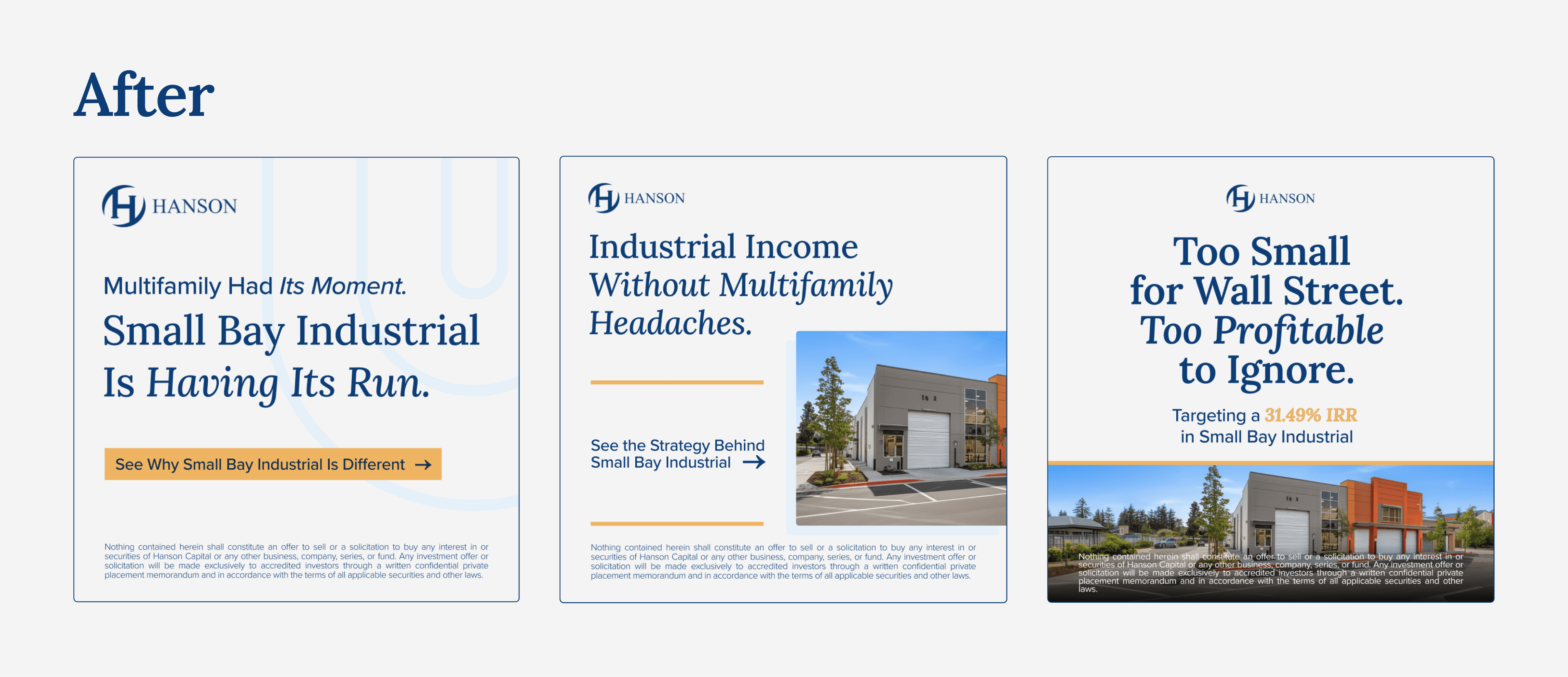
A Visual System Easy to Apply
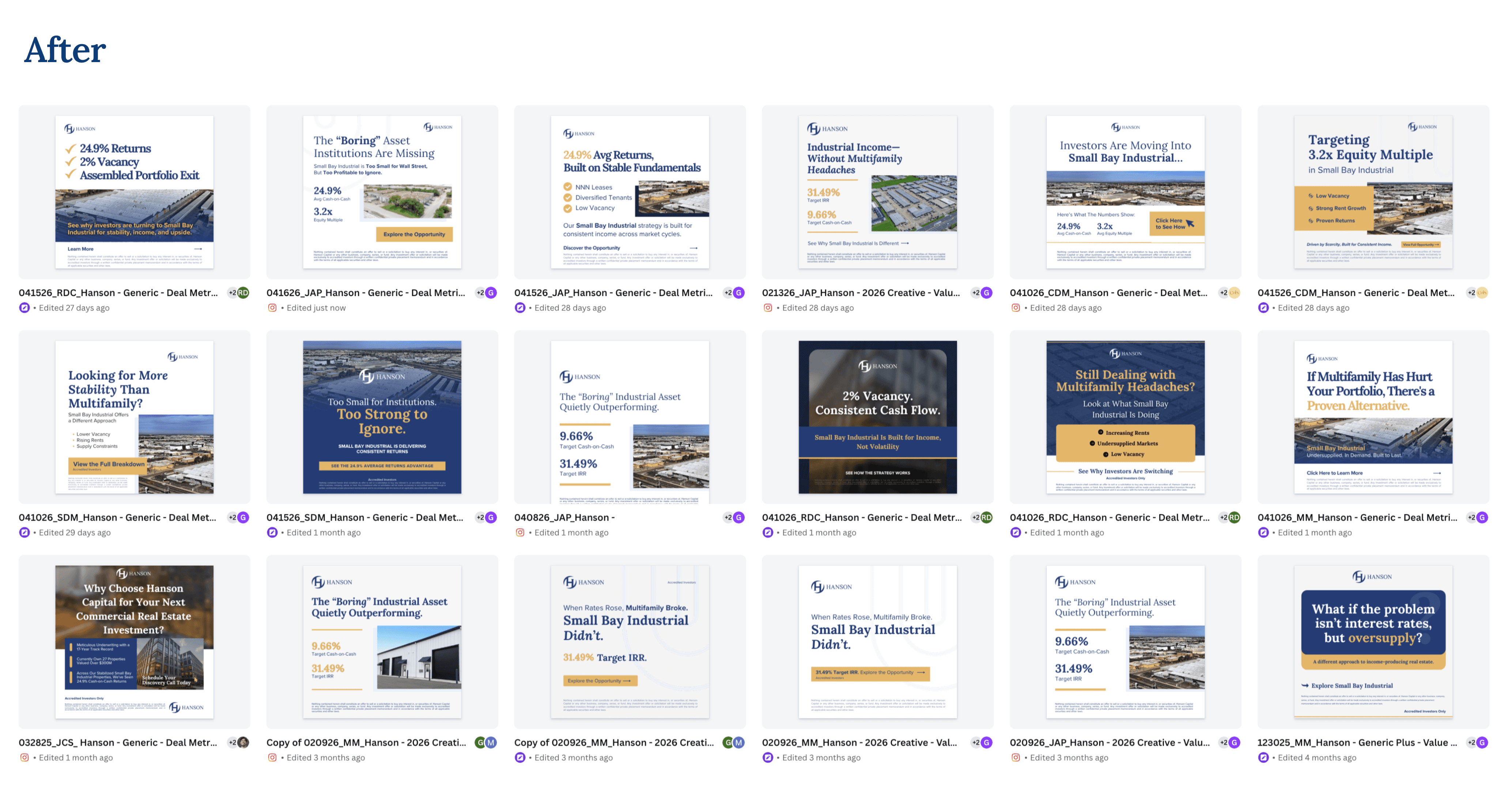
To ensure the new direction didn't rely only on specific, isolated assets, I put together a brand kit with clear usage rules, application examples, and editable templates. The goal was for the design team to produce ads and landing pages quickly while maintaining the same brand perception in every delivery.
The system defined the palette, typography, image usage, containers, CTAs, hierarchies, and concrete composition examples. As a result, the brand could scale in volume without every piece looking like it was designed from scratch.
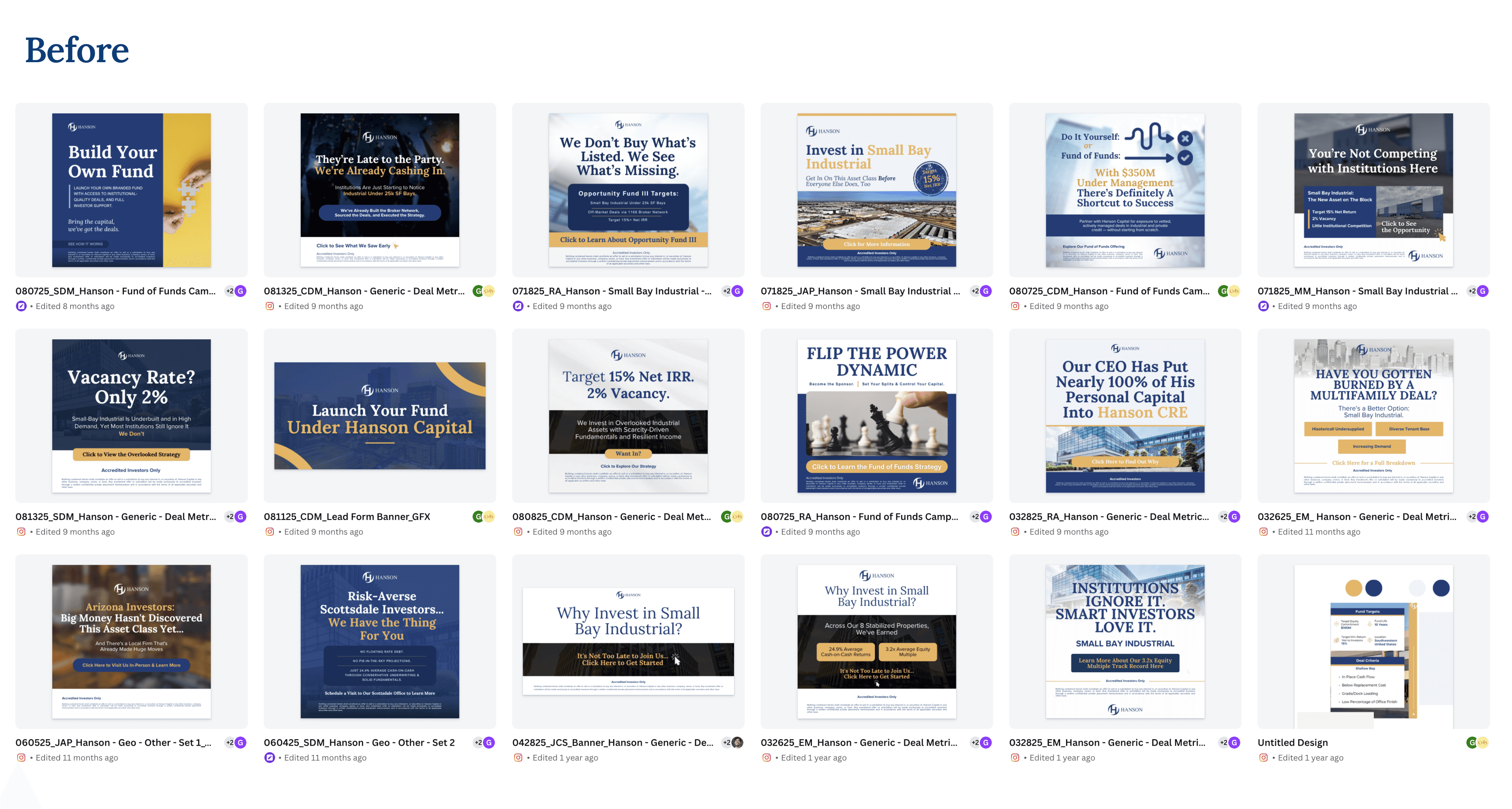
Visual System, Templates, and Scalable Production
In addition to the rebrand, I built a brand kit and a template system so that the design team could produce consistent materials without starting from scratch on every design choice. The system defined rules for color, typography, hierarchy, image usage, CTAs, and specific composition examples.
I also proposed a 70/30 logic for creative production: keeping 70% of already validated resources to ensure consistency and performance, and reserving 30% to test new compositions, visual resources, or ways of presenting the message. Each asset could be reviewed on Frame.io, adjusted as needed, and used to feed new variations.
To speed up the process, I developed a Claude skill that helped generate on-brand assets and structures faster. AI didn't replace creative judgment, but rather helped turn repeatable system rules into a more efficient workflow for iterating landing pages and campaigns.