Background
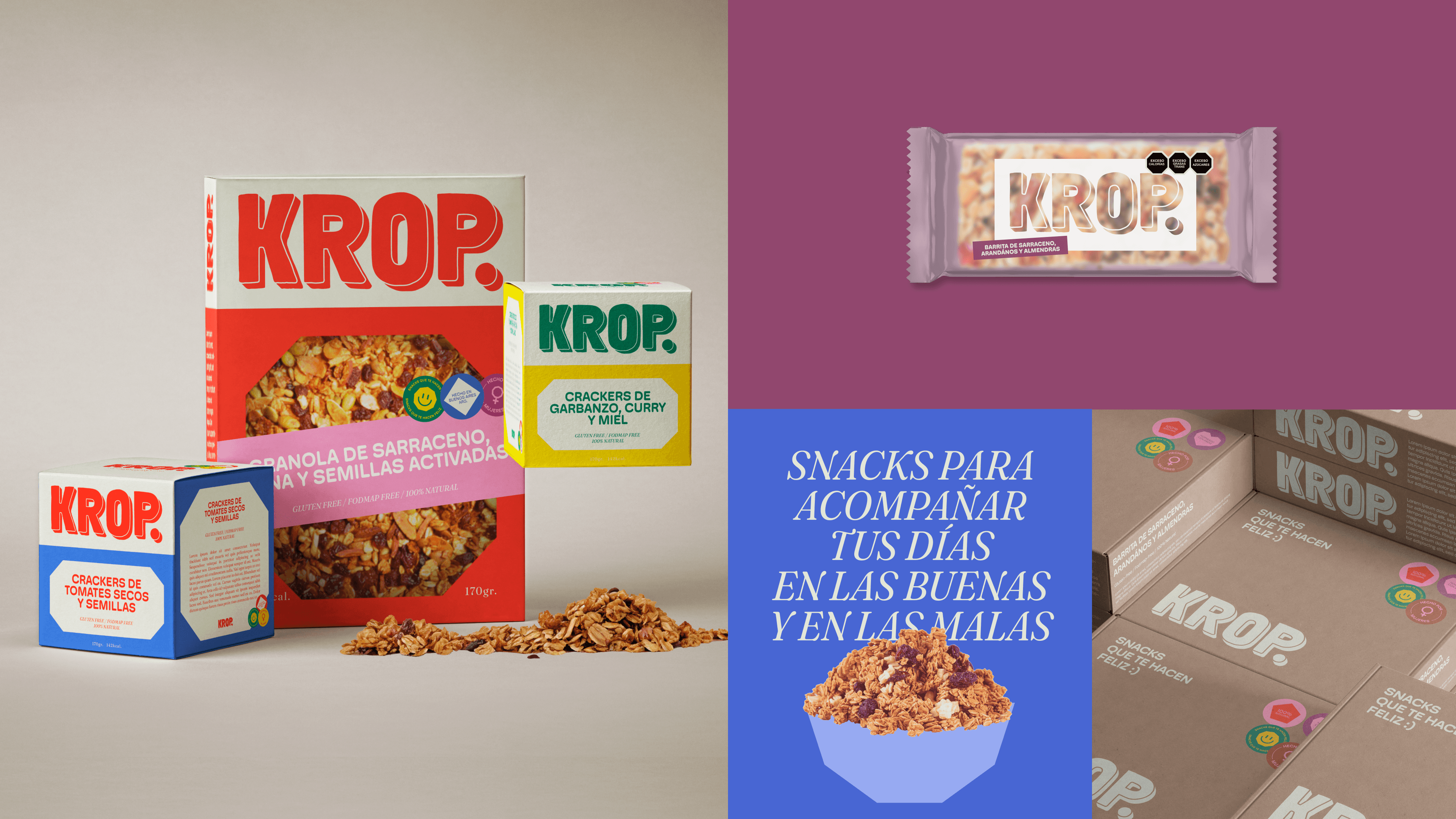
KROP was born from the drive of two friends who started cooking at home, tweaking recipes and selling boxes of homemade, creative, and gluten-free snacks. With out-of-the-ordinary flavors and a very unique energy, the brand needed an identity that could accompany its growth without losing that homemade, fun, and experimental spirit.
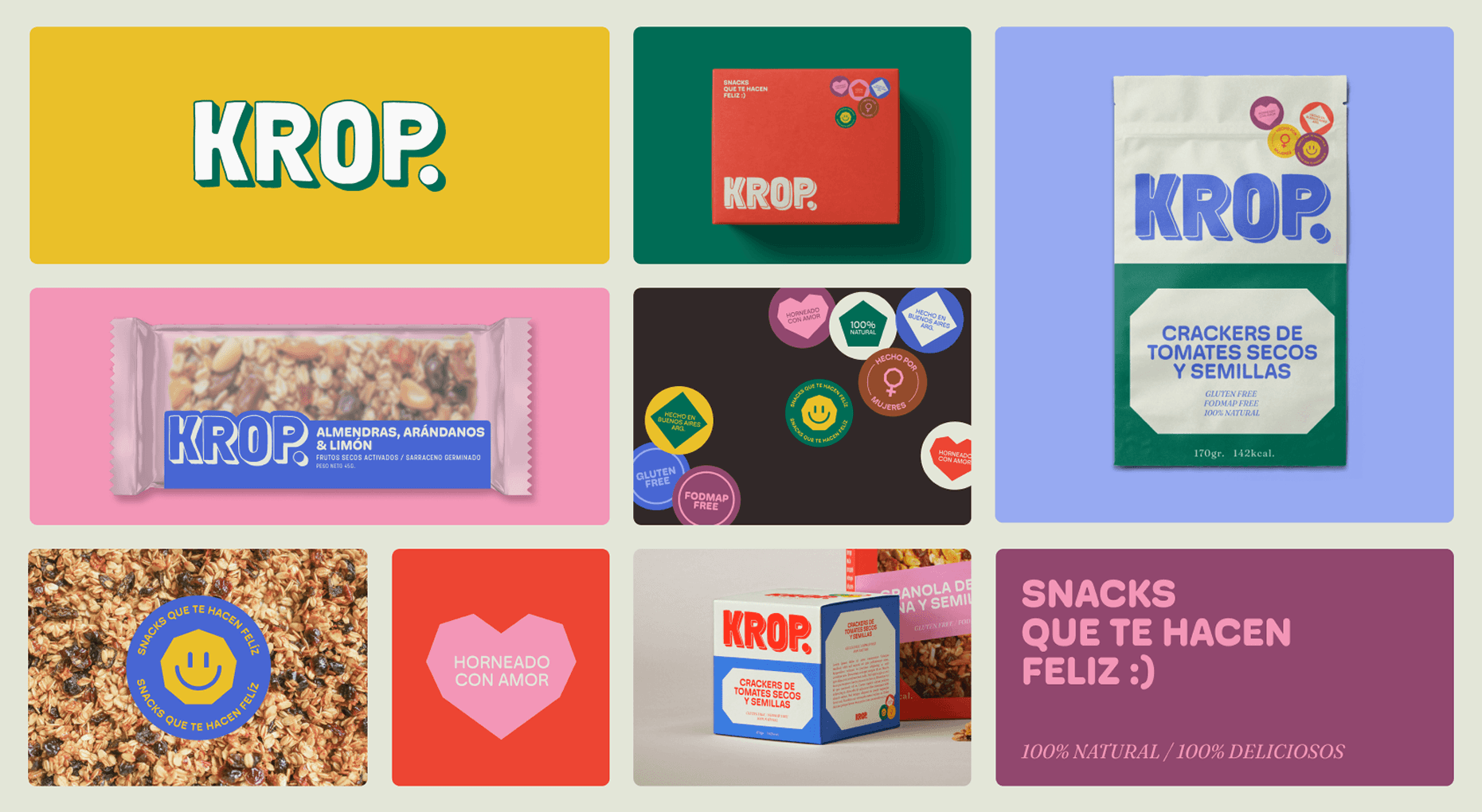
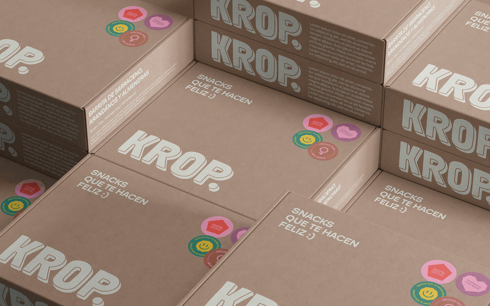
The challenge was clear: to create a visual and packaging system that felt vibrant, healthy, and tasty, but was also cheap to produce, easy to apply, and scalable. The brand was transitioning from a more artisanal approach to a more formal stage, with products ready to sell better, replicate in volume, and coexist on shelves.
Process
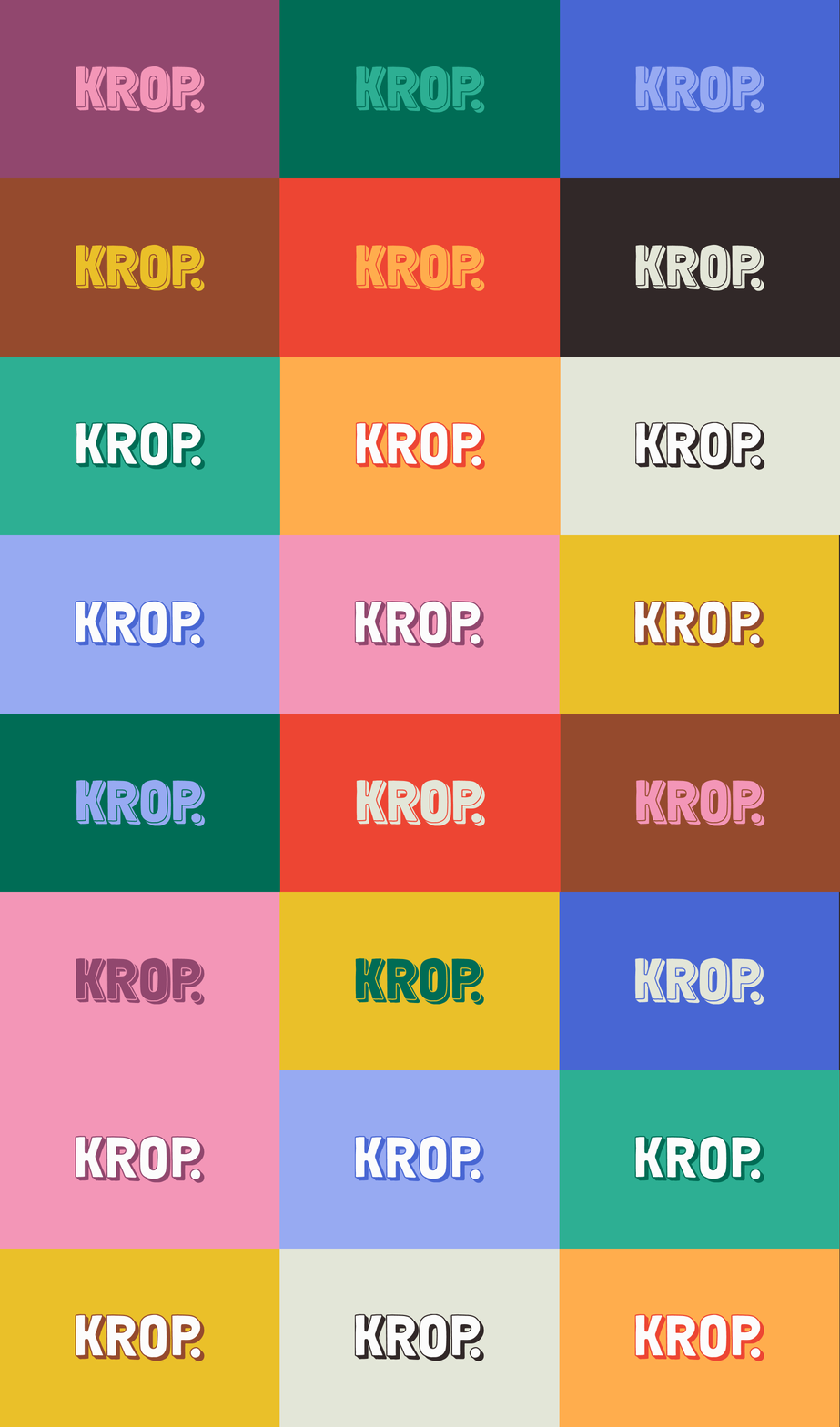
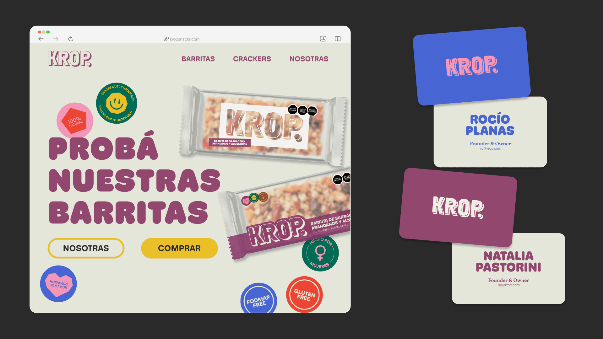
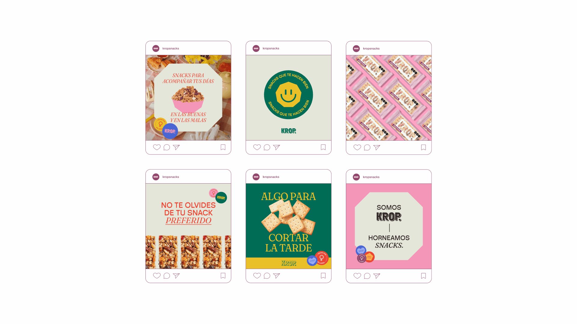
I designed the visual identity, the overall creative direction, and the packaging system, aiming for each box to stand out without relying on expensive resources. The solution relied on curved typography, polygonal shapes, a powerful analogous palette, and a flexible graphic language, capable of adapting to different flavors and formats without losing consistency.
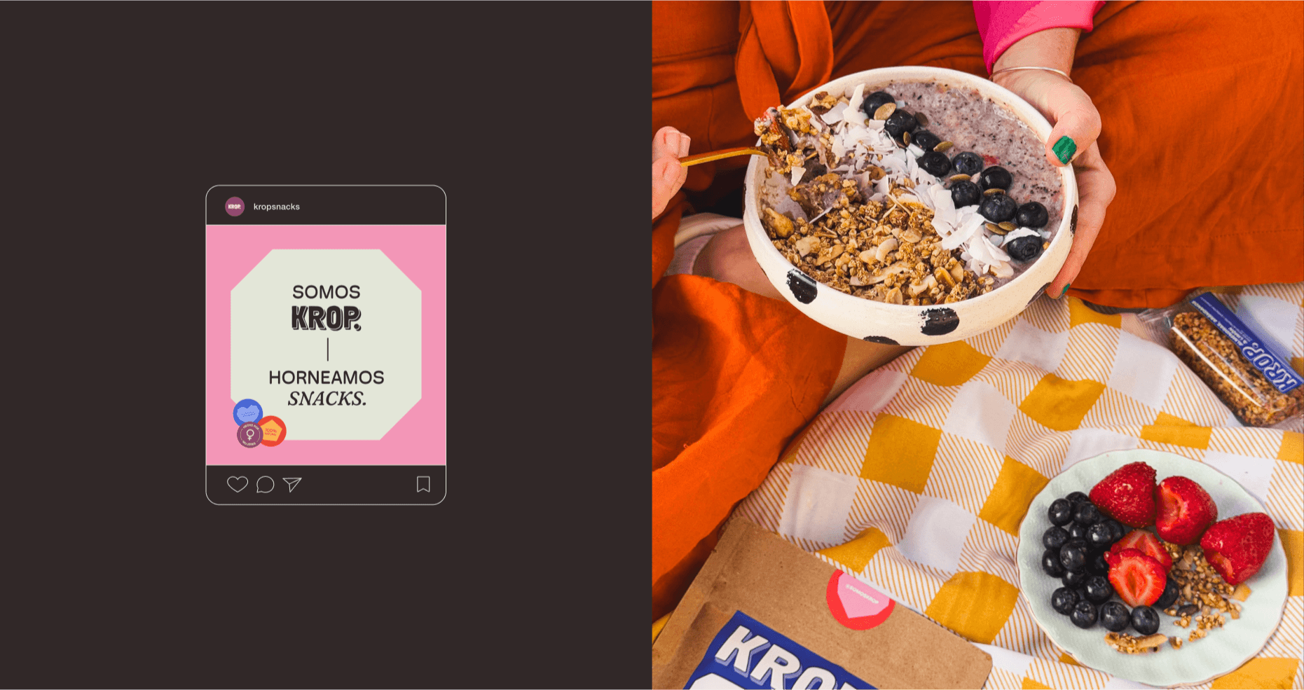
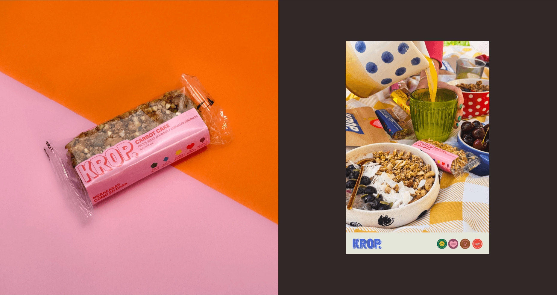
The result was a playful and dynamic identity, designed for a simple product but with personality. A visual system easy to replicate, economical to print, and distinctive enough to grow alongside the brand, from its first homemade boxes to a more orderly and scalable production.