A brand designed to attract the right investor
Secured Land Fund needed to improve the quality of its leads. The brand was generating interest, but often from the wrong profile: investors who did not fully understand the opportunity, were not qualified, or did not connect with the type of product the fund offered.
The problem was not just within the ad campaigns. It was also in the copy, the visual hierarchy of the messages, and the overall look & feel of the brand. Communication felt functional, but it did not convey enough trust, clarity, or institutional perception to appeal to high-net-worth investors.
I redesigned the visual identity, landing pages, and template system to make the brand feel more credible, organized, and aligned with the type of investor they sought to attract.

A visual narrative based on architecture
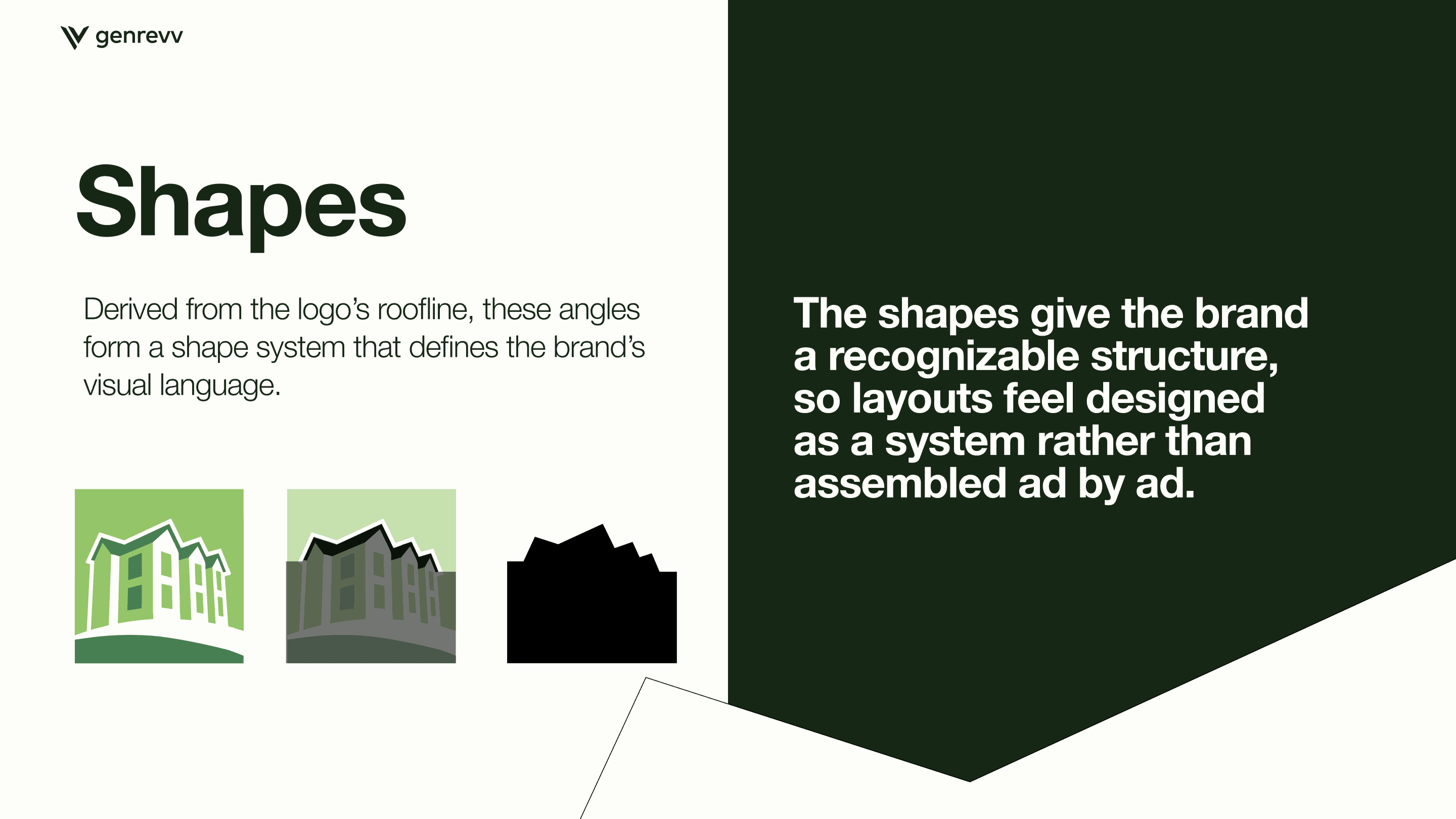
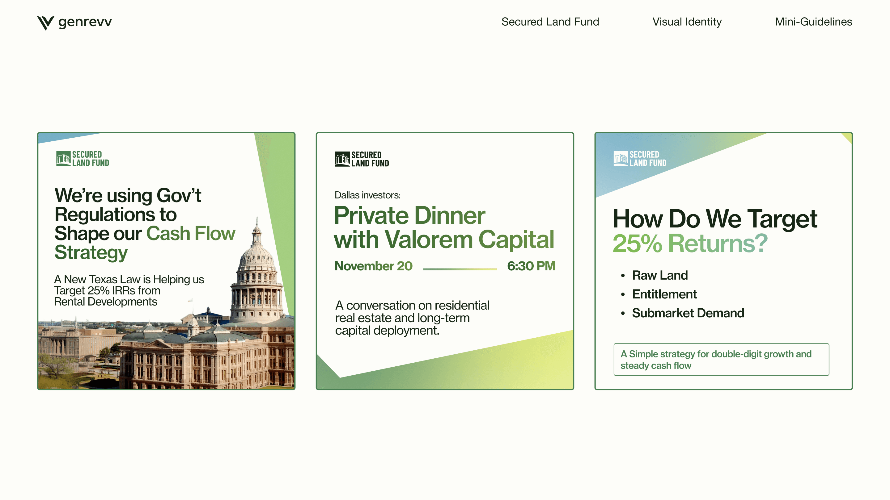
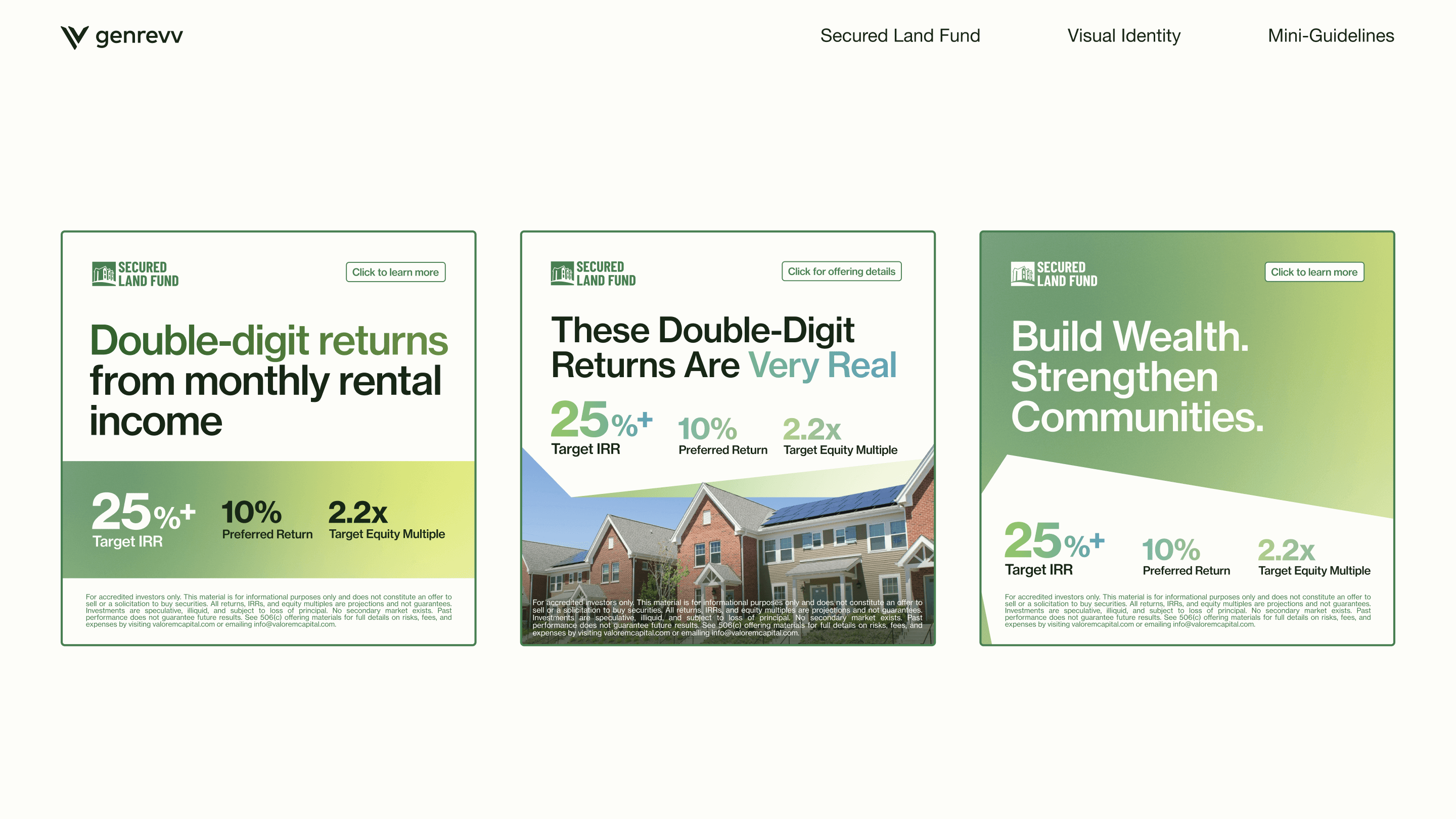
The new identity was built from the geometry of real estate: roofs, angles, blueprints, structures, and shadows. These shapes were transformed into a proprietary graphic language to organize layouts, contain images, and give the brand a more recognizable presence.
The goal was for SLF to stop relying on isolated pieces and start feeling like a system: a consistent, flexible, and easy-to-scale brand across ads, landings, and sales materials.
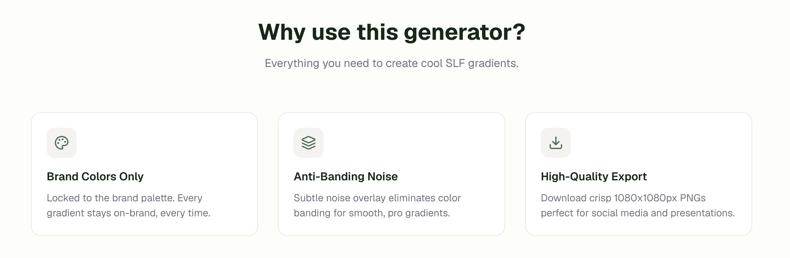
Gradients, color, and depth
I also worked on the palette and background assets to elevate visual perception. Soft gradients with subtle noise and analogous transitions made it possible to create warmer, more organic, and less promotional compositions.
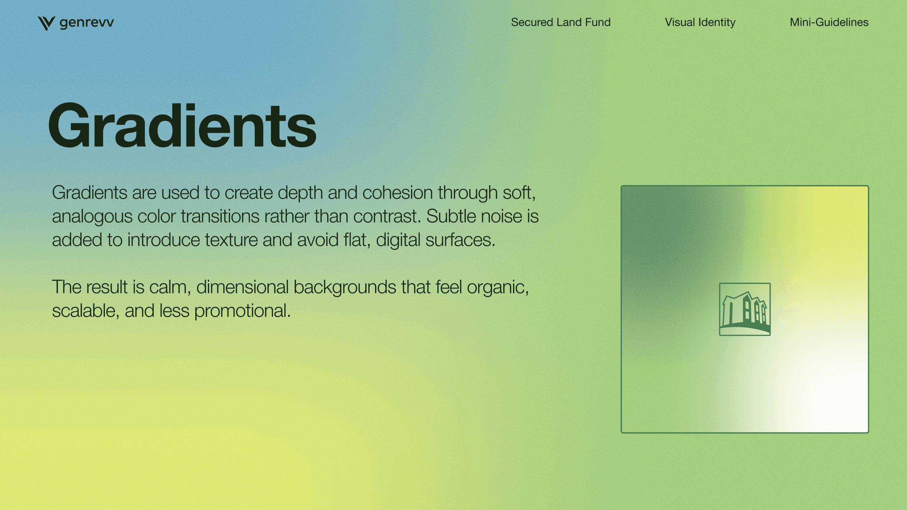
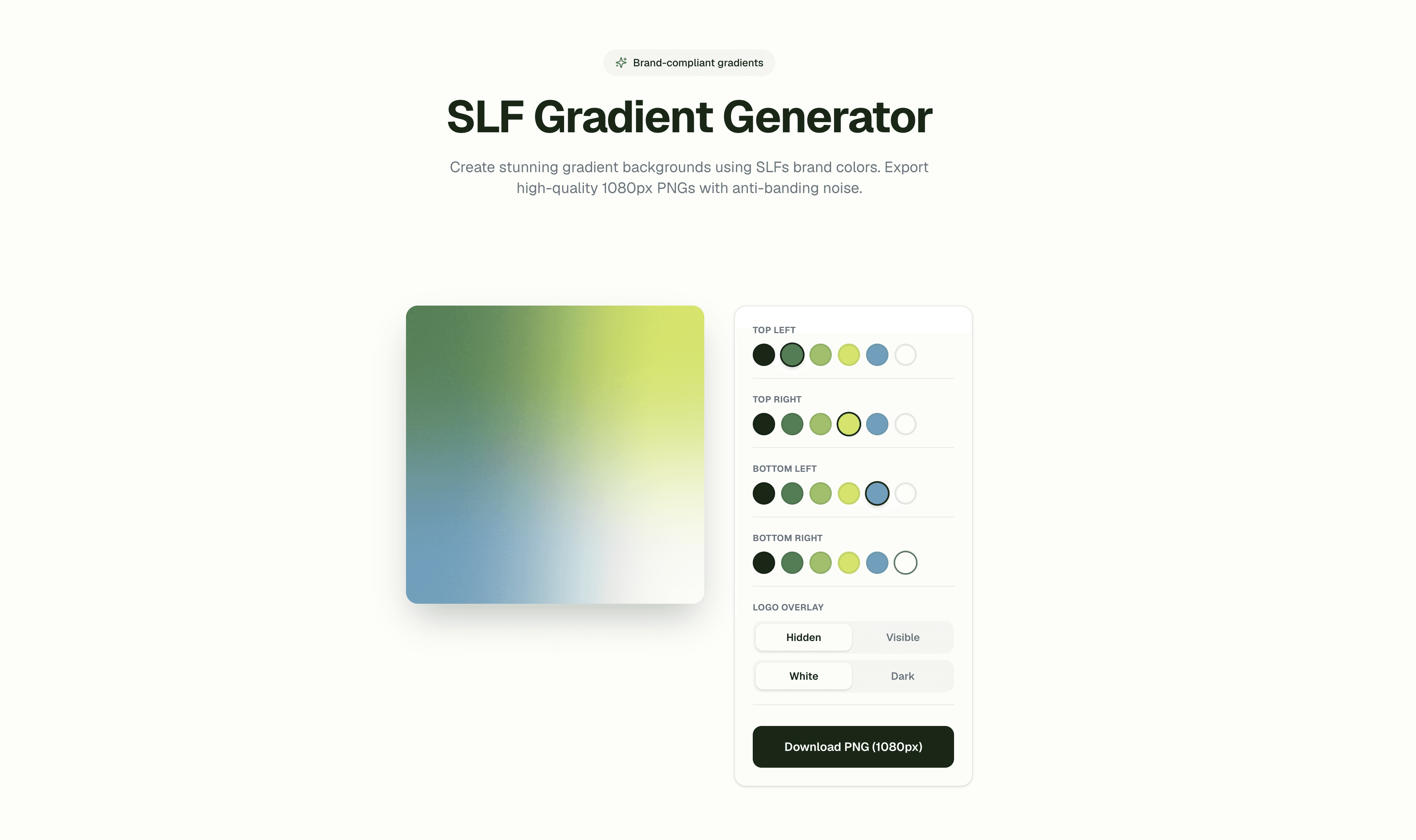
Since Canva significantly limited control over these backgrounds, I built an external system to generate on-brand gradients with greater precision and variety.
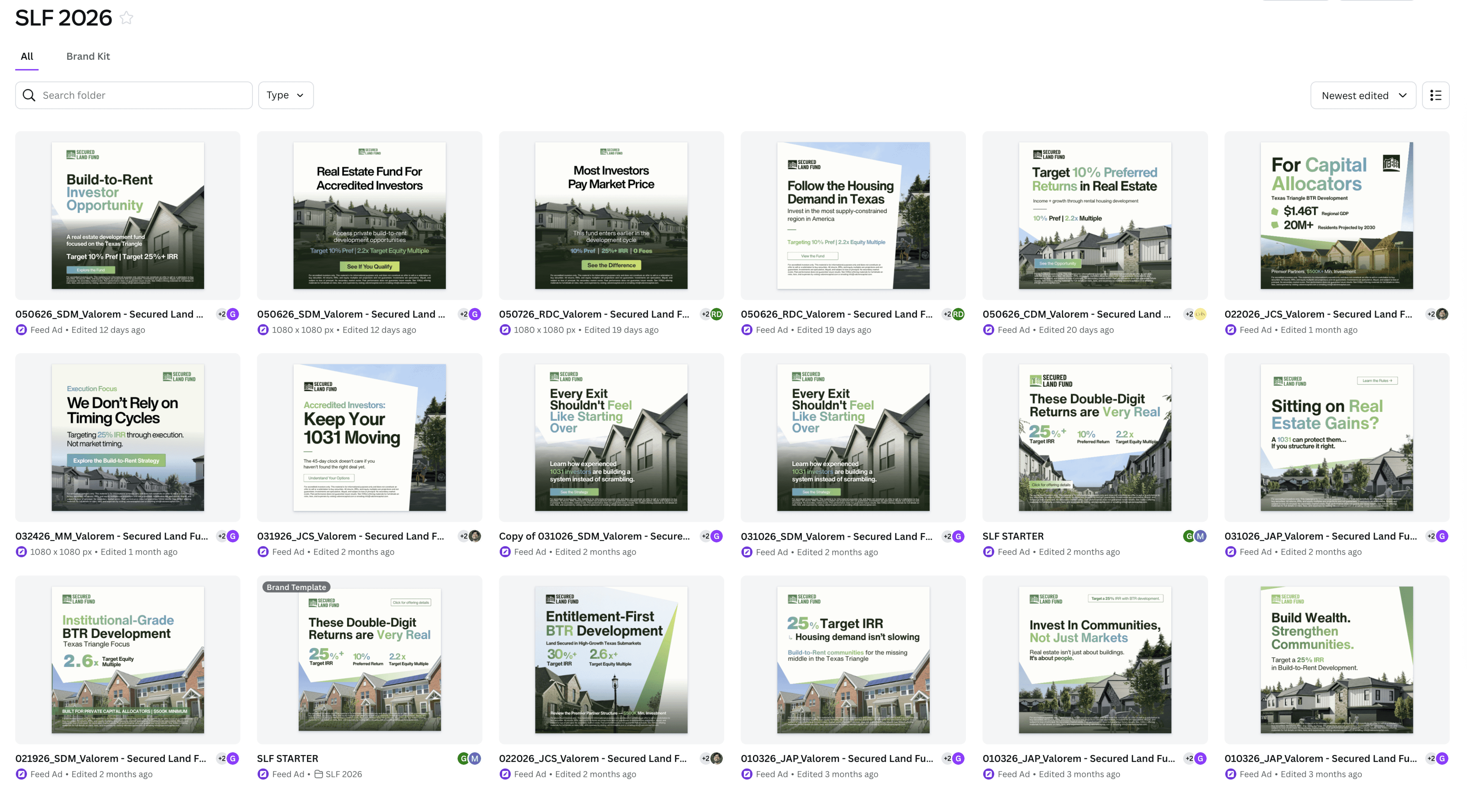
Templates to test without breaking the brand
I built templates and use-case examples so the team could produce campaigns with greater speed and consistency. The system defined how to use typography, color, images, CTAs, disclaimers, shapes, and hierarchies to ensure every piece maintained the same brand perception.
The templates allowed testing of different angle variations, from projected returns and cash flow to community impact, regulations, and market opportunities, without making each ad look like it belonged to a different brand.
Landings and AI-assisted production
The landing page was designed to explain the investment opportunity in a clearer and more trustworthy way: thesis, metrics, model, projects, process, FAQs, team, and authority signals. The goal was to help better qualify investor intent from the very first touchpoint.
In addition, I set up a custom Claude skill to generate on-brand landing pages and copy faster, and Gemini Gems to generate new images and angles of buildings for sale. I also guided the team on using AI applied to design, defining how to integrate it into the workflow without losing visual standard.
Result
The outcome was a clearer, more credible, and highly scalable brand. SLF went from a functional identity to a visual system with its own narrative, reusable templates, and AI tools that enabled the production of landings, ads, and visuals with greater speed and consistency.
Better visual and verbal alignment with qualified investors.
More institutional, clear, and trustworthy identity.
Graphic narrative based on roofs, angles, and architecture.
Templates for campaigns and landings.
On-brand gradient generator.
Gemini Gems to generate buildings and new visual angles.
Claude skill to accelerate on-brand production.