Tooki: A product designed to turn doomscrolling into real-world plans
Tooki is a mobile app I co-founded to offer a simple alternative to passive scrolling: instead of infinite feeds or hyper-curated profiles, it displays nearby plans that you can join that very same day.
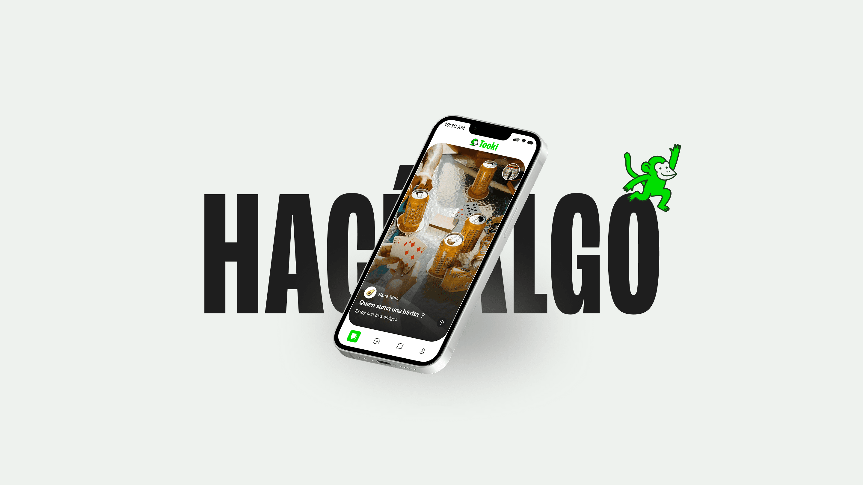
The idea is straightforward: you open the app and find something to do right now. Plans are temporary, lasting 24 hours, and are designed to move people from their phones to the real world. “Do something” serves as the guiding principle for the entire product: less browsing, more action.
I led the product from concept to launch, working on vision, strategy, UX, identity, go-to-market, and overall coordination with the development team.
Problem definition and objectives
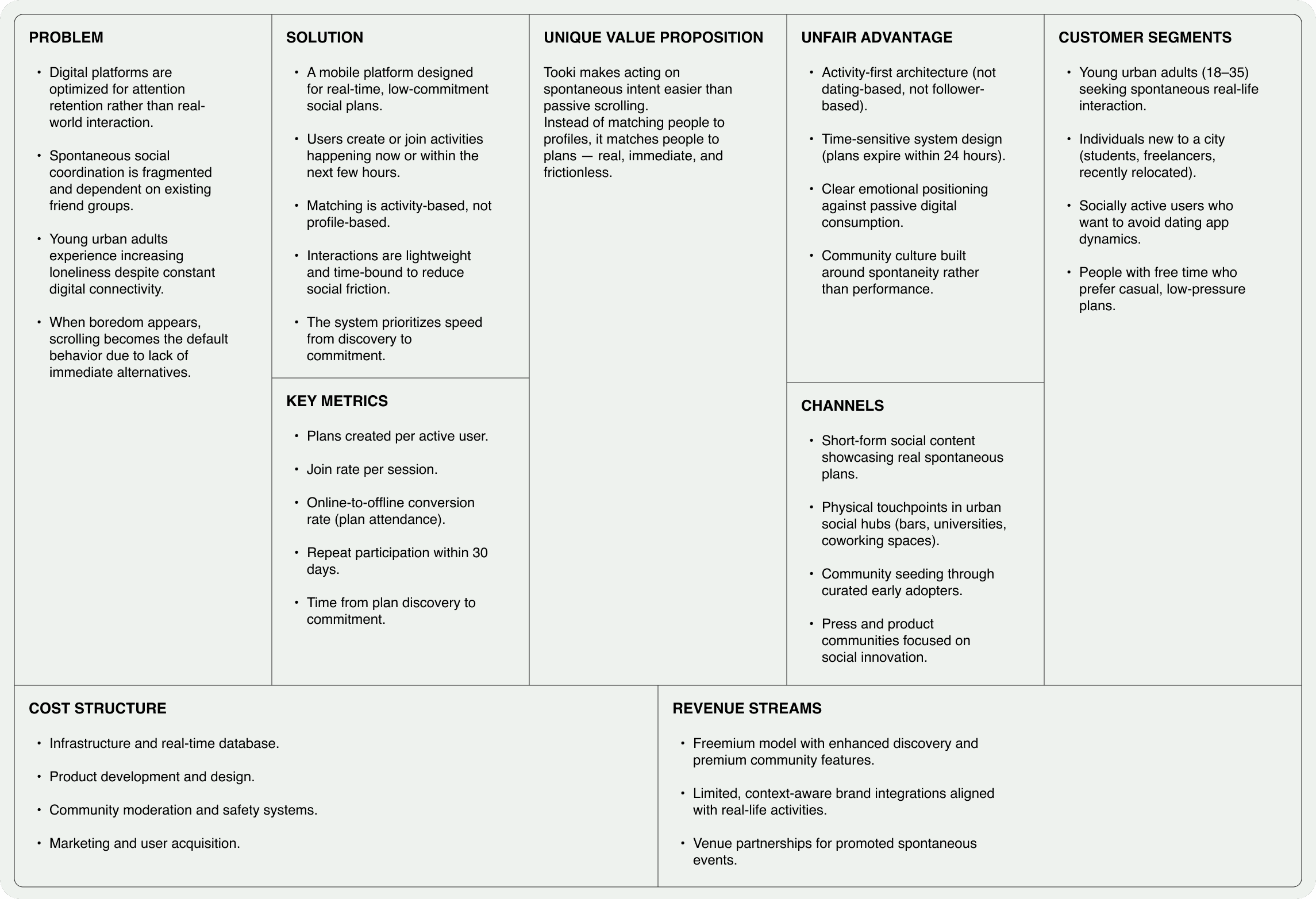
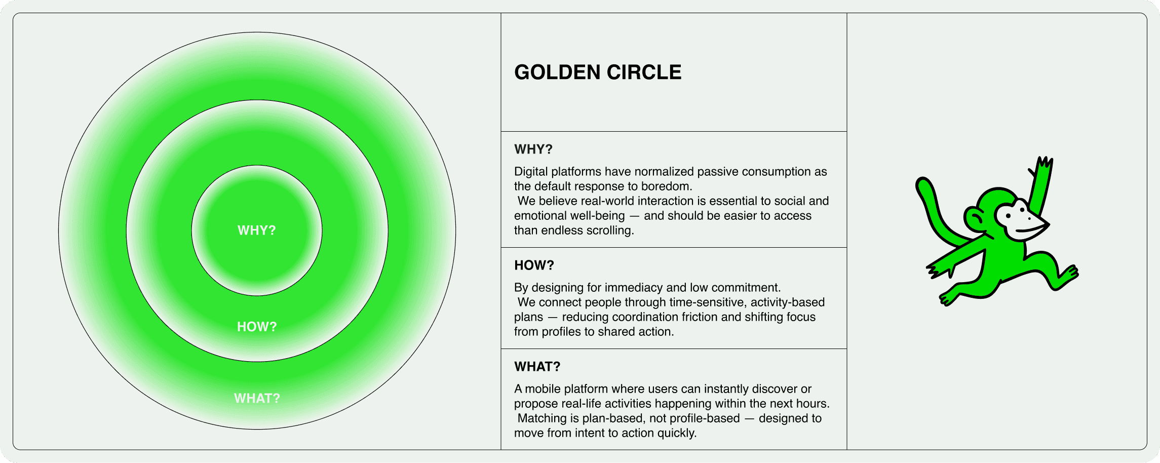
Social networks are optimized to retain attention, not to generate real encounters. Boredom ends in scrolling because consuming content is easy, whereas coordinating a spontaneous plan is usually awkward, slow, or dependent on the same old groups.
I reframed the problem as a product imbalance: scrolling is too easy; doing something in real life is not.
To organize that hypothesis, I developed a Lean UX Canvas that helped us define users, value proposition, risks, and key assumptions: liquidity, social friction, and online-to-offline conversion.
Product vision and scope
Tooki was designed to prioritize offline action over screen time. The goal was not to make the user stay longer, but to get them out faster with a concrete plan in place.
That's why the scope was kept intentionally simple: nearby, short-term plans with low commitment and a 24-hour expiration. We left out complex profiles, feeds, and features that could add comparison, friction, or unnecessary browsing.
Identity and brand direction
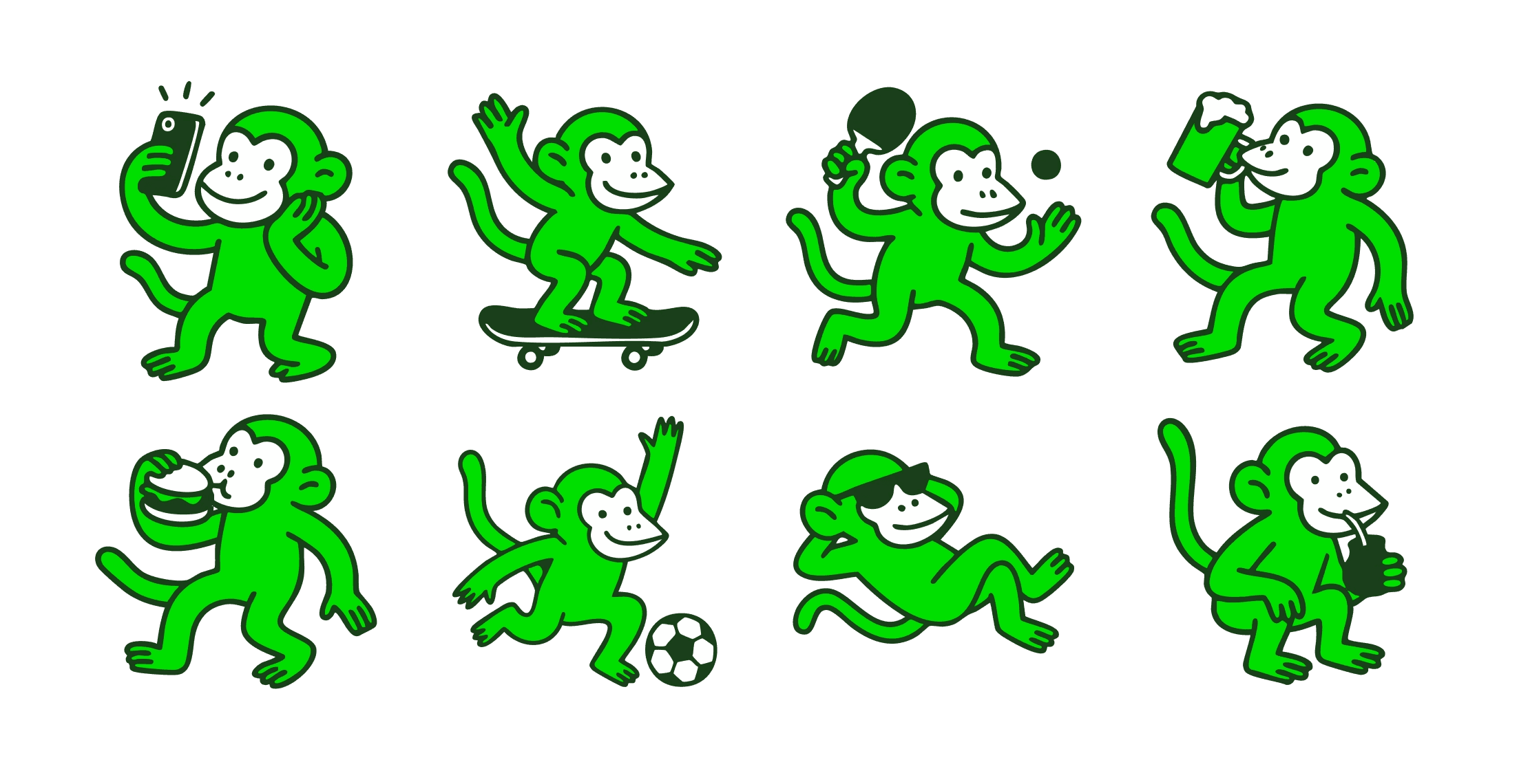
I also developed Tooki's identity to reflect the very same idea as the product: less screen time, more real life.
The brand needed to feel spontaneous, young, and approachable, without falling into the aspirational or hyper-curated aesthetic typical of many social apps. Tooki doesn't want you to build a perfect version of yourself; it just wants you to find something to do right now.
The name, visual energy, and mascot stem from a simple idea: going back to acting a bit like apes. Moving, playing, meeting up, improvising, and enjoying simple things in the real world. The monkey serves as a friendly nudge to get out of hyper-digital mode and do something.
Visually, I worked on a vibrant, playful, and flexible identity, using energetic colors and illustrations. The system was designed to scale across the app, landing page, social media, pitch, and launch materials without becoming rigid.
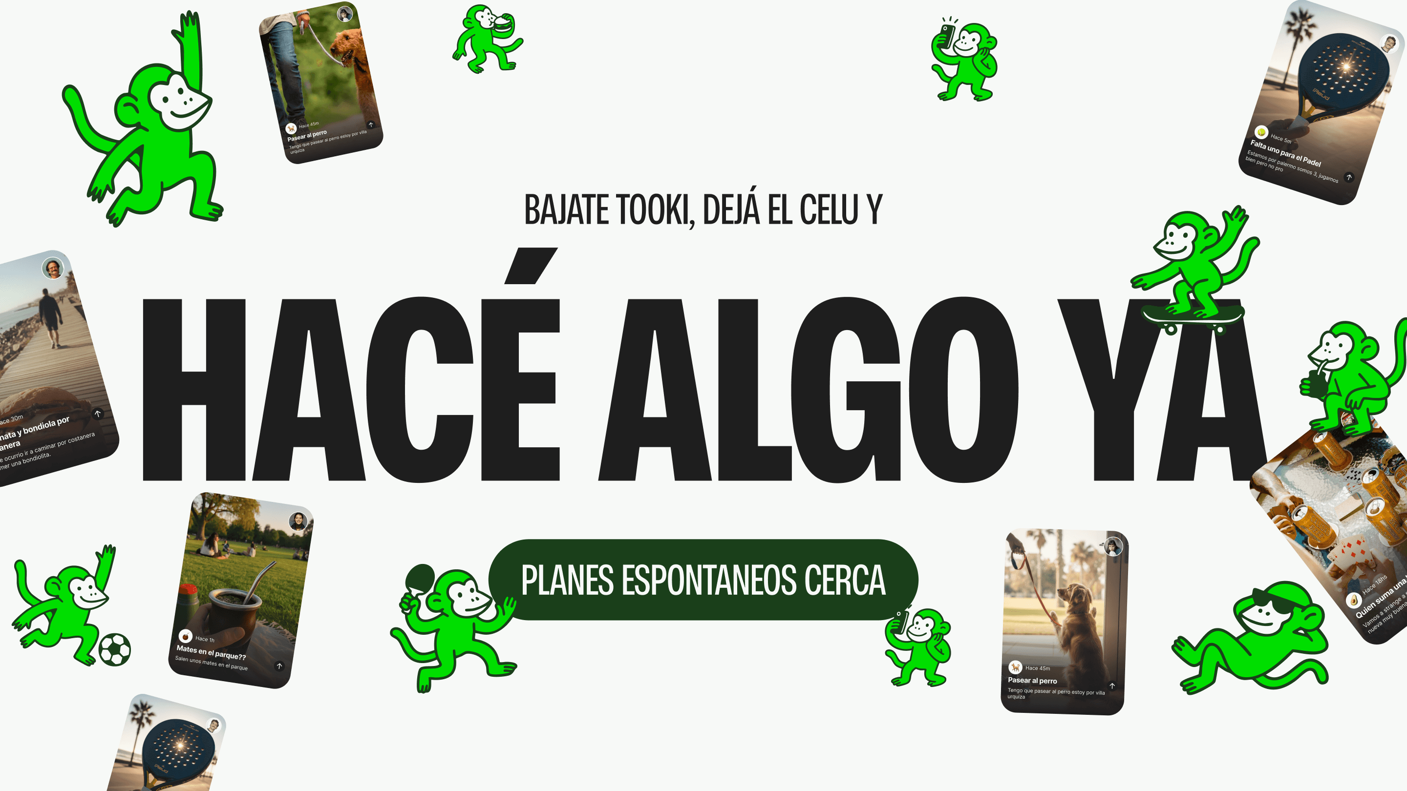
The concepts "Do something" and "Do something now" worked as the starting point for both the verbal and visual systems. The brand uses a straightforward tone, almost like a friendly nudge, with short, action-oriented messages.
The identity was not treated as a separate aesthetic layer, but as a tool to reinforce the product proposal: making joining a plan feel easy, close, and socially light.
UX problem prioritization
UX was prioritized based on a central question: does this help make the plan happen in real life?
Every decision aimed to reduce the distance between opening the app, discovering a plan, and joining. Three things were prioritized:
Reducing the time between seeing a plan and committing to it.
Lowering social friction between people who don't know each other.
Increasing the likelihood of the meet-up actually happening.
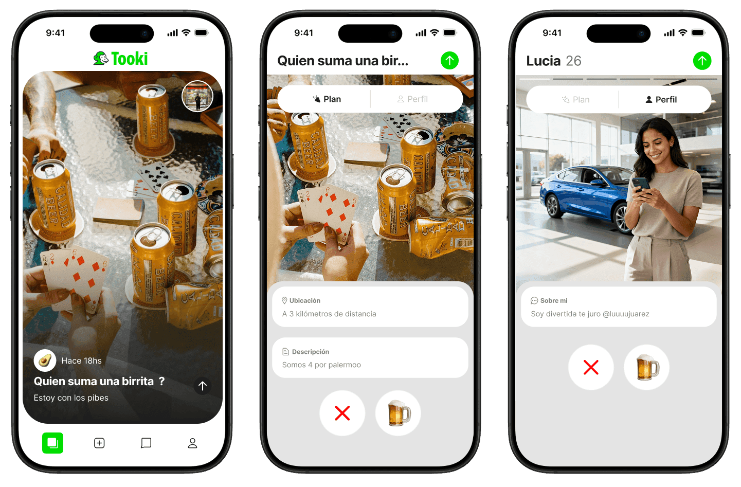
The architecture was designed to be direct: when opening the app, users arrive at the available plans, without dashboards or unnecessary navigation. The focus was on deciding, not on endless exploration.
Information architecture and user flows
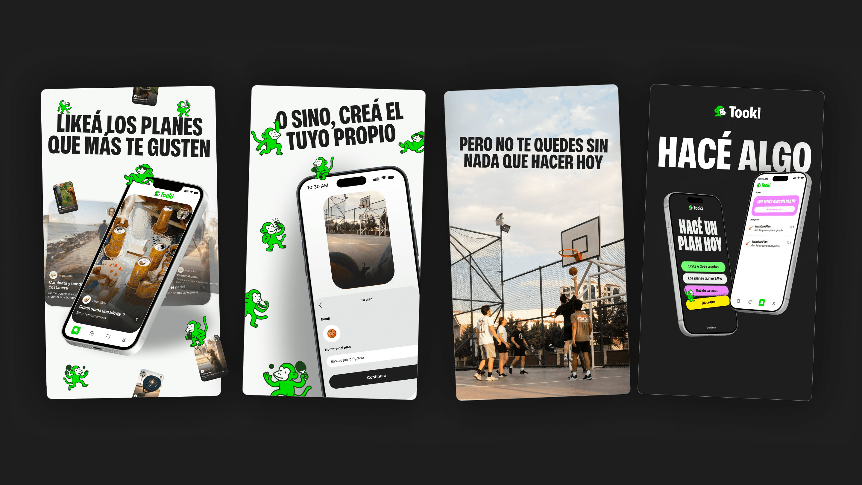
The information architecture was designed to be as simple and action-oriented as possible. From the moment the user opens the app, they land directly on the available plans, with no intermediate dashboards or unnecessarily deep navigation. This reduces cognitive load and keeps the focus on deciding, not browsing.
During the design process, multiple user flows were mapped and tested. Shown below are representative examples of how we structured key interactions to reduce friction and accelerate the transition from online intent to offline action.
Primary discovery and commitment flow
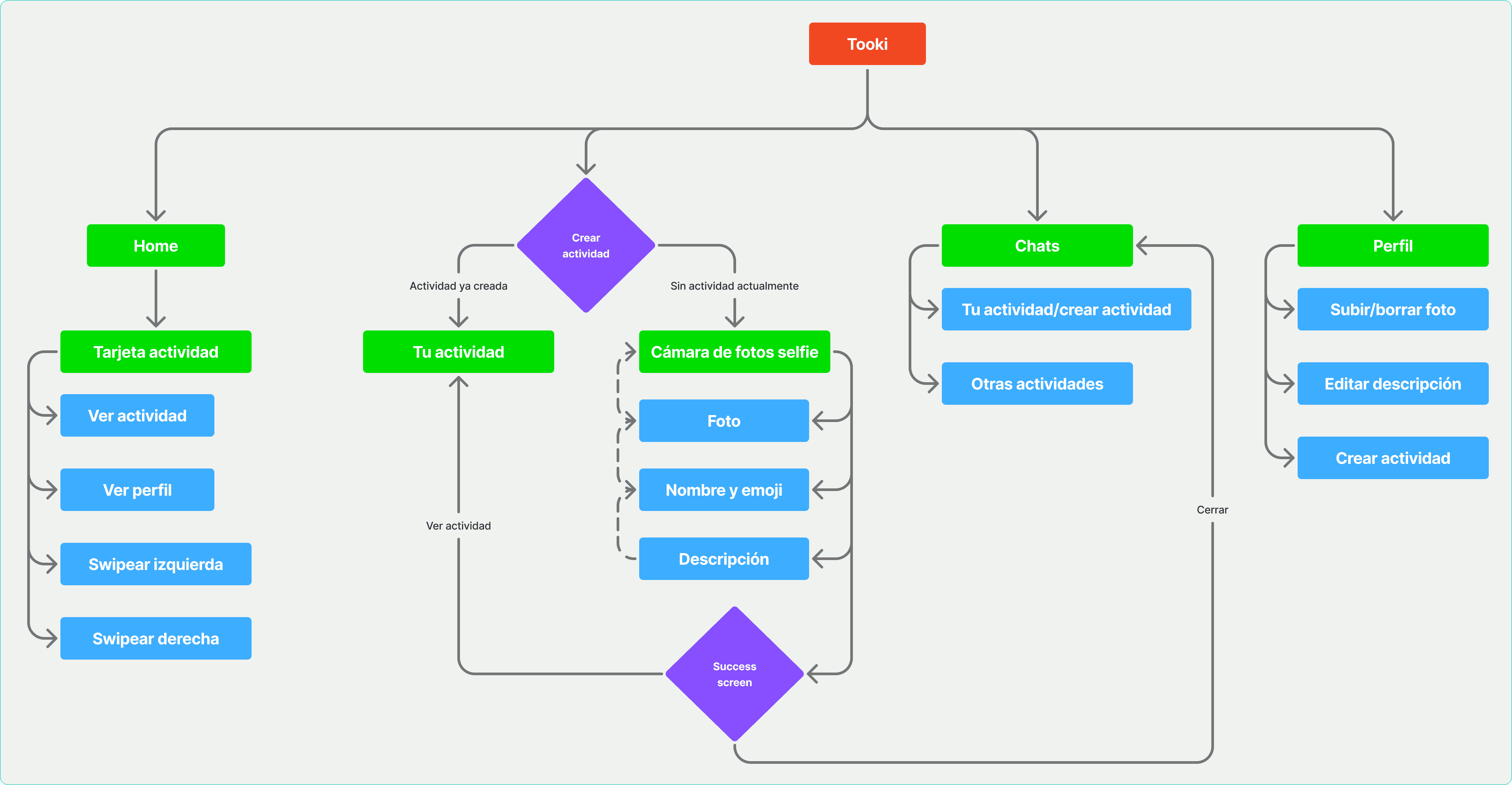
Onboarding flow
Plan management flow
Defining metrics of success
Tooki's success was not measured by traditional metrics like session duration or time spent in the app. That went against the purpose of the product.
Instead, we defined success as real-world movement: from interest to offline action.
We worked with two main funnels:
Joiner Funnel
First swipe interaction
Chat initiated
Activity attended
Host Funnel
Plan created
First like
Chat initiated
Activity confirmed
Separating these behaviors allowed us to understand the health of both sides of the system and pinpoint where friction arose before a meeting.
Solving the cold start problem
Since Tooki relies on real-time participation, liquidity is the main risk at launch. Because of this, the strategy prioritizes geographic density over broad acquisition. Rather than trying to grow everywhere at once, the idea is to activate specific areas first and expand afterwards.
Plans created by Tooki help seed initial activity, reduce empty states, and drive local traction before scaling up.
Website
Landing page designed for early access and controlled activation.
Mobile App
Onboarding
Core navigation
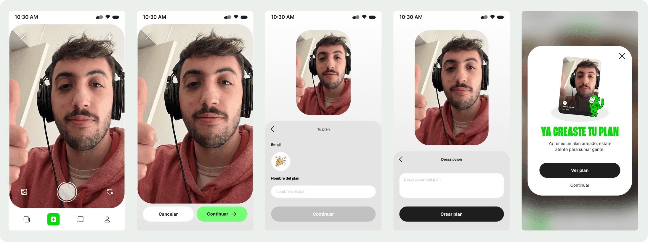
Plan creation flow
UI Preview